Marketing, Communications & Public Affairs
Our Services
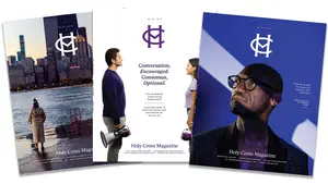
Holy Cross Magazine
The College's flagship publication, Holy Cross Magazine is published three times a year. New stories can be read weekly at its digital home. In 2025, HCM was named best magazine published three or four times per year, as well as a finalist for the Robert Sibley Magazine of the Year, the industry's highest honor, in the annual CASE Circle of Excellence Awards.

Media Relations
We manage media relations and serve as a professional communications resource for students, faculty and the administration.
Brand and Graphic Identity
We guide the branding, graphic and editorial standards for all members of our campus community. Our Graphic Arts division (#36 Fenwick) processes requests for designing and printing posters, business cards, letterhead and more.

Website
We oversee the content and design of www.holycross.edu. For edits, feedback or questions regarding the website, please submit a web request. A member of our team will respond in the order in which your request is received.
Marketing, Communications & Public Affairs
Hogan 312
Box PR
Worcester, Mass. 01610-2395
Graphic Arts
#36 Fenwick